- Home
- NEWS
-
HISTORY
- What is Botanical Art?
- What is Botanical Illustration?
- Botanical Art History Books >
- Herbals
- Florilegia and Flora
- Patrons of Botanical Art >
- Past Masters - Botanical Art and Illustration >
- Famous Asian Botanical Artists (600-1900)
- 20th & 21st Century Botanical Artists >
- Botanical Photographers
- Botanical and Herbal Art Online
-
ARTISTS
- Botanical Artists in the UK
- Botanical Artists in North America
- Botanical Artists in Europe
- Botanical Artists in Australia and New Zealand
- Botanical Artists in Asia
- Botanical Artists in Africa
- Botanical Artists in Latin America
- Botanical Printmakers, Photographers, Sculptors et al
- The Jill Smythies Award
- Botanical Artists on Facebook
- Botanical Art Blogs
-
Exhibitions
- Calls for Entries - OPEN exhibitions
- Online Exhibitions >
- RHS Botanical Art & Photography Shows >
- The Shirley Sherwood Gallery of Botanical Art >
- Hunt International Exhibition of Botanical Art & Illustration
-
UK
>
- North America >
- Europe >
- Australasia >
- Asia >
- Africa
- ARCHIVE: World Wide Exhibition of Botanical Art 2018
-
Education
- NEW BOOKS about Botanical Art and Illustration >
-
Best Botanical Art Instruction Books
>
- Tips and Techniques >
- Botanical Art Video Tips >
- Online Botanical Art Instruction >
- International Directory: Botanical Art Teachers
- International Directory of Botanical Art Courses >
- Artist Residencies, Scholarships and Bursaries
- Diplomas and Certificates >
- Distance Learning Courses
- Talks, Lectures & Tours
- Botanical Education on Facebook
- Materials
- Groups
-
Botany
- Why botany matters to artists
- Botany Books for artists >
- Scientific botanical illustration
- Plant Forms and Anatomy
- Plant Evolution and Taxonomy
- Plant Names and Botanical Latin
- Botanical Dictionaries
- How to Identify Plants
- Recording a Plant / Sketchbooks >
- Botanic Gardens & Herbaria >
- Blogs about Plants and Flowers
- Contact
Do you feel the need to learn more about how to produce appropriate colours for botanical subjects?
This page is a work in progress and will have a lot more content when it is finished.
This page covers:
This page is a work in progress and will have a lot more content when it is finished.
This page covers:
BASICS: What you need to know about colour- and how it works
|
Painting with Colour
|
Books about Colour for Botanical Artists
|
ADVANCED: What you need to know about colour - and how it works
|
What you need to know about colour - and how it works
Confidence in using colour - first learn "how to see colour"
The handling and use of colour appears to be an aspect of painting in which beginners have least confidence and one which they fear the most
Anne-Marie Evans - the opening sentence of Chapter Five of her book "An Approach to Botanical Painting", about "Colour: Paint Qualities in Practice"
|
Many botanical painters start out being less than confident in their using colour - but they also very much want to improve.
Often this is because they know very little about
|
Improving your confidence involves:
|
TIPS: How to improve your recognition of colour
- Practice identifying all the colours you can see in a plant - create a study of a plant and develop a related colour
- Use a colour recognition app (Apple or Android) - Develop your ability to both recognise differences between colours and sort them into the correct order - with instant feedback when you get it wrong!
- Practice naming colours - sounds odd but it works. Making yourself name a colour makes you look more carefully
- Buy a copy of the RHS Colour Chart - The RHS Large Colour Chart (Sixth Revised Edition) is not cheap (£199) - but includes every colour used to categorise plants.
- Develop colour charts which include tints and shades. People often get most used by tints and shades - and yet tints and shades are very common amongst plants
- Take your own colour charts into a the field and record colours like Ferdinand Bauer - see below for an explanation
- Get your eyesight checked for colour deficits - sometimes the reason you have problems is because you have a weakness in seeing colour
|
The Royal Horticultural Society Colour Chart; 2nd edition (1966)
|
The RHS Colour Chart is the standard reference used by horticulturists worldwide for recording plant colours. Resembling a paint chart, it has 920 colours which can be matched precisely to flowers, fruits and other plants in order to record and communicate colours accurately across the world. Each colour has a unique number and letter code as well as a name. |
Colours and Colour Brands
Most artists start learning about colour - by buying colours.
- At this stage they very often don't know what they are buying or what they should be buying.
- Many may be buying colours on a list provided by a tutor without understanding why they have been put on the list. (I've also known a number of tutors who have not revised their lists in years despite changes in the quality of paint produced by favoured suppliers!)
I never know what to say to artists when they tell me about the specific paints they have used in a painting - and I know for certain they have included one or more fugitive paints - meaning those areas where the fugitive colours have been used will fade fast and/or change colour. On the whole I find it easier to preach the gospel of lightfastness and the importance of knowing whether you are using archival paints on an archival support!
Katherine Tyrrell (the author of this website)
|
WHAT'S IMPORTANT TO BOTANICAL ARTISTS & ILLUSTRATORS?
It's important that botanical artists use media which is:
The main reasons why people like a particular art medium (e.g. particular brand of watercolour paint) are due to:
Many botanical artists prefer to work with media where the colouring agent (pigment or dye) is a high percentage compared to other ingredients. |
WHAT MAKES COLOURS DIFFERENT?
A number of factors make some media better than others. It's important to understand about the manufacturer as well as the media if you want to avoid wasting money.
|
Colouring agents: Pigments and dyes
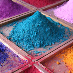
All media – oils, watercolours, acrylics, pastels and coloured pencils – are derived from the same pigments and dyes. What actually varies between different media is the vehicle used to bind the pigment together.
Colour - a materials perspective #1 - pigments and dyes | Making A Mark
|
All colours (or colouring agents) come from pigments or dyes. All media uses the same pigments and dyes as colouring agents.
It's the other ingredients - and the ratio of other ingredients to colouring agent - which sometimes make a difference to how it behaves when you come to use it. |
Fugitive colours in art media are colours which are based on pigments or dyes which have a short life. They are not lightfast which means they are not permanent. Katherine Tyrrell |
Pigment is a very small particle of coloured material that is mixed in with a binding medium. The pigment gives paint its colour.
Narayan Khandekar Director of the Straus Center for Conservation and Technical Studies and Senior Conservation Scientist
|
PIGMENTS
|
DYES
|
Pigment & Dyes SUMMARY:
- Pigments and Dyes come from a number of different sources
- A pigment is a material which can provide colour but which does NOT dissolve in water
- A dye is a pigment ground down to very fine particles which can impart colour when suspended in a solution or medium
- Pigments do not all behave in the same way - because they come from different sources
- What makes paint vary can be the nature of the pigment - but it can also be the binder or filler used to make the medium. In other words it's not just about the pigment load.
REFERENCE: Pigments, Dyes and Permanence
- Colour - a materials perspective #1 - pigments and dyes | Making A Mark - This post provides a materials perspective on colour for artists and a basic overview of pigments and dyes.
- Colour - naming dyes, pigments and paints | Making A Mark - Every pigment has an international classification and standardised name but not every colour is what it says it is.
- "What are fugitive colours?" | Making A Mark (2010) by Katherine Tyrrell - highlights the ASTM Lightfastness Standards for different media
- How lightfast are your artist grade coloured pencils? | Making A Mark (2008) - highlights how coloured pencils are tested for lightfastness - and how many of mine failed the test
- Artist Quality Pigments & Artists' Colourmen
Lots of photos of pigments and some links to websites which describe and record Artists' Colourmen. - Winsor & Newton Resource Centre: Composition & Permanence Tables - lists W&N colours and tells you the colour number and name, the pigment numbers and the qualities and features of the colour: lightfastness / permanence / granulation
- Julie C Sparks provides a lot of detail about the origins of different colours in Pigments: Historical, Chemical and Artistic importance of coloring agents
- Bruce MacEvoy (Handprint) provides
- a guide to watercolor pigments
- a very detailed explanation of the different attributes of pigments and dyes in the material attributes of paints
- The Forbes Pigment Collection
Professional artists don't just pick colours 'because it looks right'.
|
PROPERTIES: Artists "need to know" the properties of the pigments and dyes used in creating the colour - in particular the degree to which the pigment or dye is lightfast (meaning it's suitable for artwork of archival standards)
|
CHARACTERISTICS: Some pigments and dyes are
|
|
What you need to know:
|
Permanence |
Painting with Colour
Colour Charts and Shade Cards
|
The major benefit of developing colour charts is that you can match the hue and tone on the paper to the plant in the field (or in your studio!)
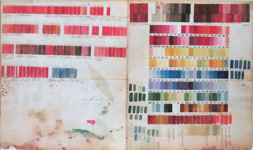
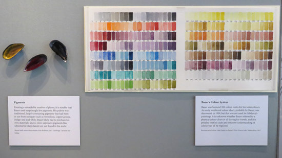
The first - and probably the most famous artist to use colour charts ever - was Ferdinand Bauer who numbered all his colours and shades and then used numbers to annotate the sketches he could not paint on the spot with the colours he had seen. (My Ferdinand Bauer page is in draft and now this page is started I must finish it!) Bauer's colour charts have been lost but it's believed that Czech botanist and explorer, Thaddäus Haenke found one. This is now kept at the Royal Botanic Garden Madrid along with other charts that Haenke developed. However we know more about the colours he had in his chart due to the numbered monochrome sketches he left. In 2017, the Bodleian in Oxford developed a display to demonstrate how Bauer's system worked - in liaison with the publication of the book Painting by Numbers |
REFERENCE:
|
Painting by Numbers: The life and art of Ferdinand Bauer
by David Mabberley
by David Mabberley
|
This is the story of the life and painting techniques of Ferdinand Bauer.
He perfected the technique of painting by numbers i.e. sketching and colour-coding in the field, and then colouring later using his pre-prepared and number colour charts on his expedition with Matthew Flinders to circumnavigate Australia. |
Hardcover: 272 pages
Publisher: NewSouth Publishing Publication date: 1 Nov. 2017 Language: English ISBN-10: 1742235220 ISBN-13: 978-1742235226 Dimensions: 24.1 x 3.3 x 30.5 cm BUY THIS BOOK Painting by Numbers: The life and art of Ferdinand Bauer
Painting by Numbers: The Life and Art of Ferdinand Bauer
|
The author, Professor David J Mabberley AM, is a British-born Australian botanist, educator and writer. He was consecutively
- Director of the University of Washington Botanic Gardens;
- Keeper of the Herbarium, Library, Art and Archives at the Royal Botanic Gardens, Kew; and
- Executive Director of the Royal Botanic Garden, Sydney
- Emeritus Fellow, Wadham College, Oxford University
Werner's Nomenclature of Colours: Adapted to Zoology, Botany, Chemistry, Minerology, Anatomy and the Arts
By Patrick Syme
By Patrick Syme
|
Werner's Nomenclature of Colours is a small hardback book of named colour samples - page after page of colour swatches and fascinating names! An original copy of Werner's book is housed in the Special Collections of the Natural History Museum in London. The book was recently republished by the Natural History Museum and has proved very popular. |
Hardcover: 78 pages
Publisher: The Natural History Museum Publication date: First edition (8 Feb. 2018) Language: English ISBN-10: 0565094459 ISBN-13: 978-0565094454 Dimensions: 14.9 x 1.6 x 23.2 cm BUY THIS BOOK |
- In 1774, Abraham Gottlob Werner published Von den äußerlichen Kennzeichen der Foßilien. He was a distinguished geologist and bergmeister (mine manager). He wanted a better way of describing minerals and devised his comprehensive colour scheme to enable a better standardised description and classification of minerals. The work, incorporating this colour nomenclature with some modifications, was translated....
- ....into French by Claudine Guyton de Morveau (née Picardet) in 1790 and
- ....into English by Thomas Weaver in 1805.
- Patrick Syme (1774–1845), painter to the Wernerian and Horticultural Societies of Edinburgh took the colour scheme to a whole new level. His revised book was published in 1814 with the revised title of Werner's Nomenclature of Colours, with Additions, arranged so as to render it useful to the Arts and Sciences. Syme's important contribution was to (1) increase the number of colours listed to 108 (2) introduce painted colour charts and (2) each colour was attributed to where it could be found in the animal and plant worlds as well as in minerals. This resulted in some extremely interesting names for the colours.
- The book was then used by Charles Darwin in his scientific observations.
- Essentially Darwin and his colleagues used the colour scheme in exactly the same way as the colour swatches devised by Bauer. Colours were annotated on drawings and notes in relation to specimens collected by reference to the numbered colour swatches in the book.
Colour Mixing and Contemporary Colour Charts
|
The very best way of learning how to mix colours is to
|
How to avoid spending a lot of money mixing paint to create charts of colours you may never use.
Sometimes it's best to start with
|
|
THE TWO MAIN WAYS OF MIXING COLOURS
These are: PHYSICAL mixing of one colour into another to create a new colour - using a brush or palette knife or pastel or pencil What that colour looks like depends on
OPTICAL Mixing of one colour with another - laying one over the other but allowing the base colour to still be seen. Optical mixing is typically created on the support. Examples include:
|
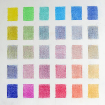
TIPS for creating colour charts and shade cards Develop colour charts based on
File your colour charts in a folder and use them as a reference guide for colour mixing. |
REFERENCE:
- Making Radial Colour Charts - Eunike Nugroho produces colour charts of watercolour paints that you can hold up to the plant, flower or vegetable
TIPS: Getting Colour Mixes, Charts and Glazes Right
|
REFERENCE:
A series of articles by Carolyn Payzant
Other non-botanical bloggers
|
In terms of art supplies I can to tell you there's massive endorsement for Daniel Smith watercolours - particularly the quinacrodines - and the Winsor and Newton Permanent Rose (another quinacrodine PV19) and Winsor & Newton Winsor Violet (Carbozole dioxazine PV23). “Greens look unnatural when used straight from the tube, so I prefer mixing my own. I am a devout believer in the utility of shade cards – they save time and will help you learn about the properties of paint." Mary Ann Scott SBA |
TIPS for painting specific colours
If you have examples online of specific exercises involving how to paint using specific colours - which you would like me to share a link to - please contact me
|
GREEN
|
An approach to colour mixing: I mix all greens from primary colours, blue, yellow and usually a small amount of red. A few years ago I developed a simple system based on the light value of the blue as the predominant factor when deciding on the green mix. |
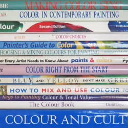
Books about Colour - for Botanical Artists
Very few books providing botanical art instruction cover colour, how it works and matters relevant to painting botanical art in any depth. Most are limited on important aspects of colour theory - and things an artist needs to know - and confine themselves to "how to" examples which provide a list of specific colours.
|
MY RECOMMENDATIONS
My PRIMARY recommendation to any botanical artist who wants to develop their competence in relation to colour is to buy art instruction books which tackle colour as the SOLE TOPIC of the book. |
REFERENCE: ARTISTS' BOOKS ABOUT COLOUR
BELOW are links to my blog reviews about other recommended books about Colour - which are NOT related to botanical art
|
Botanical Art Instruction books - covering Colour
BELOW is a summary of the chapters and pages - in various botanical art instruction books - primarily devoted to COLOUR in order of the quantity and quality of the content.
If you know a book you've found particularly useful please let me know.
The issue for me in relation to colour is that most books seem to adopt one or the other two approaches i.e.:
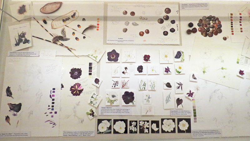
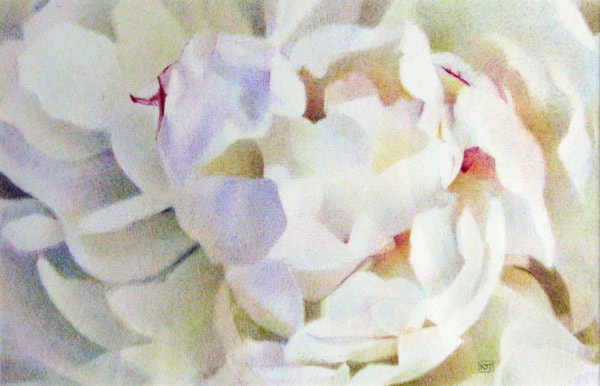
I have a botanical artist friend who maintains that you can tell how well a botanical artist understands the theory and components of colour and colour mixes by looking at how they portray white and black/dark blooms. I agree. Below is an exercise I did a while back. I drew a 'white' flower in coloured pencils using on using only optical hatching of complementary and analogous colours. No white or ivory pencils were used in this drawing.
If you know a book you've found particularly useful please let me know.
The issue for me in relation to colour is that most books seem to adopt one or the other two approaches i.e.:
- assume that the reader already knows the basics in relation to colour - and hence does not include a lot about colour
- delivers the basics in relation to colour as they know from experience that many people have not been taught these properly!
- It's a very difficult balancing act. My own view is that it might work better if
- books were more clearly graded for beginners, intermediate and advanced students of botanical art
- then one could then focus more on colour topics relevant to the level of knowledge and competence.
- books were more clearly graded for beginners, intermediate and advanced students of botanical art
I have a botanical artist friend who maintains that you can tell how well a botanical artist understands the theory and components of colour and colour mixes by looking at how they portray white and black/dark blooms. I agree. Below is an exercise I did a while back. I drew a 'white' flower in coloured pencils using on using only optical hatching of complementary and analogous colours. No white or ivory pencils were used in this drawing.
Below I split books between the primary media used in the book
WATERCOLOUR PAINTING
Books which lack a comprehensive treatment of colour
- RECOMMENDED: Billy Showell's Botanical Painting in Watercolour by Billy Showell - This book includes a 38 page chapter on colour and colour mixing. As always it's written in a very accessible way which makes it an easy read. Less about precise rules and more about encouraging artists learn the basics first and then practice and experiment and find out what works for them. Lots of practical tips about
- the ratio of pigment and water within mixes and how many tonal and hue variations you can get with the same basic mixes
- how to use your brush when mixing and applying colour.
- mixing greys, greens, pinks, blues, purples, reds, browns, blacks and whites plus colour circle showing different mixes.
- the value of a doodle sheet and knowing when to lift colour fast
- how to apply colour glazes in relation to specific features and flowers
- RECOMMENDED The Modern Flower Painter (2014) by Anna Mason has an entire chapter devoted to colour (pages 26-47). This covers:
- learning to see colour by making a distinction between hue and tone and how an artist needs to be aware of how colours are perceived e.g. in relation to surrounding colours and provides a number of useful tips for how you can trick your brain into seeing colour better.
- hues, transparency, permanence and staining nature of pigments when painting in watercolour
- painting tones in light and dark colours and how to mix colours to darken a hue
- an excellent page illustrating the various levels of paint consistency via the water via milk to butter metaphor
- understanding different hues - with the hues she uses usefully demonstrated in a tonal bar. I'd have liked to see the pigment numbers indicated here as some of the hues are actually composites (e.g. Paynes Grey i.e. PB15,PBk6,PV19 and Davy's Grey i.e. PG17,PBk6,PBk19, PW5)
- how to lay out your palette and how different hues and tones relate to one another - with a Munsell example
- mixing colours on the paper using layers / glazes and colour corrective washes
- mixing hues in the palette - focusing on hue rather than tone
- mixing greens, neutrals
- RECOMMENDED Botanical Illustration from Life (2019) by Işık Güner - This includes a short but concise and useful section on Colour (Pages 98 - 105) which is grounded in the an artist who knows colour and uses it on a very regular basis. It covers
- the properties of pigments and the palette she uses
- mixing colours - on the palette and on the paper - and the need for practice to make this second nature (with lots of tips)
- Colour Contrast - in terms of tones and Colour Perspective - in relation to achieving depth within the painting
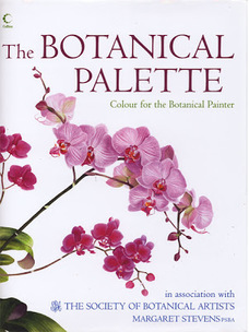
- RECOMMENDED The Botanical Palette: Colour for the Botanical Painter by Margaret Stevens. SEE BOOK REVIEW Focuses solely on the subject of how to achieve the right colour in botanical art. It provides an authoritative and helpful guide to this topic and includes an overview of the colour issues which crop up time and time again at the beginning and throughout the book.
- RECOMMENDED: An Approach to Botanical Painting (1993) by Anne-Marie and Donn Evans - Chapter 5 (pages 81-88) is a short chapter titled Colour: Paint Qualities in Practice. It covers:
- the properties of colour (e.g. opacity and transparency; staining properties; brilliance and luminosity, lightfastness and permanence) and colour recognition and includes recommendations for how to make colour charts; how to build up a colour wash in a systematic way and how to mix colours.
- If it has a weakness it lies in colour theory - although it does draw the distinction between coloured light and coloured pigment and the fact they are different.
- The last page of the chapter provides a series of exercises relating to colour mixing with a view to highlighting differences between mixing colours on the palette and superimposing different colour washes on the paper.
Books which lack a comprehensive treatment of colour
- The Art of Botanical Painting (2004) by Margaret Stevens & SBA - Lacks a comprehensive chapter about colour and deserves to be revised and improved in relation to this topic given 'The Botanical Palette' (the SBA follow-up book - see above) is now out of print. References to colour are littered around the book in relation to specific exercises but it's difficult to extract any key principles, techniques and tips for effective colour use in botanical painting. Pages 40-41 summarise pigments, identify how to make 'botanical grey' and highlight some useful tips. Chapter 7 on Foliage Colour has the potential to be useful but actually serves to highlight the very many mixes botanical artists use for foliage.
The Botanical Palette: Colour for the Botanical Painter
by Margaret Stevens
by Margaret Stevens
It includes an overview of the colour issues which crop up time and time again at the beginning and throughout the book. This was informed by a survey of students on the SBA Diploma course - in which they identified problems they had with colour.
Katherine Tyrrell - see links to my book review below
|
HIGHLY RECOMMENDED Read my detailed review
|
The second book produced by the Society of Botanical Artists with Margaret Stevens.
It focuses solely on the subject of how to achieve the right colour in botanical art. One of the major issues for botanical artists is making sure they get colours correct when painting botanical specimens. Understanding colours - and how to create the correct colour shade, tone and mix - and understanding colours - are ESSENTIAL competencies for every botanical artist. This book provides a very authoritative and helpful guide to this topic - and will doubtless be welcomed by all those seeking to develop and improve the quality of their botanical art - and improve their mastery of the colours found in plants. |
Hardcover: 144 pages
Publisher: Collins (2007) / Smithsonian in USA (2008) This book is out of print - however you can still get hold of copies second-hand - but it's very expensive! I recommend you:
I'm a big buyer of second hand books - on Amazon and elsewhere - and have very rarely been disappointed when buying from those rated above 95% BUY THIS BOOK The Botanical Palette: Colour for the Botanical Painter
The Botanical Palette: Color for the Botanical Painter
|
COLOURED PENCILS
Books which lack a comprehensive treatment of colour
- Botanical Drawing in Color by Wendy Hollander (2010), as its name suggests, covers a lot of aspects of colour in relation to coloured pencils - but tends to do so by covering all the "basics". My major reservation is that a lot of the content could be found in a number of books about coloured pencils and is not particularly related to botanical art. However I recognise that is very necessary knowledge which a lot of newcomers to botanical art lack.
- Chapter 7 is all about Understanding Colour. This covers Colour Theory and introduces basic terms used in relation to colour then looks at how to develop a colour wheel with 12 hues; colour bias theory (i.e. why you get different colours depending on which red and blue you mix) and blends; creating complementary mixes and how to identify the key features of a colour (hue, value, intensity/saturation); color harmony with an exercise at the end.
- Chapter 4 focuses on Adding Color to a toned form and how to use build tonal bars and shapes using colour.
Books which lack a comprehensive treatment of colour
- Botanical Drawing Using Graphite and Coloured Pencils (2017) by Sue Vize - has a LOT of content related to the use of graphite and no chapter on colour. Treatment of colour theory is very basic. However, it does have a useful couple of pages (93-94) on 'Botanical Greens' in Coloured Pencils which demonstrates different mixes. Sue also provides a precise set of coloured pencils for every step by step project in coloured pencils.
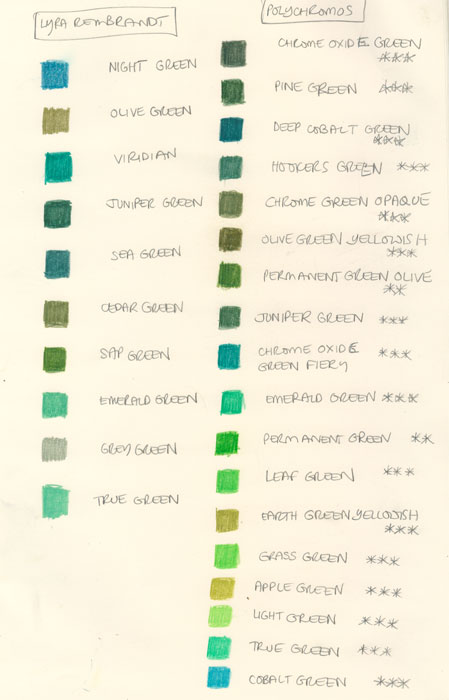
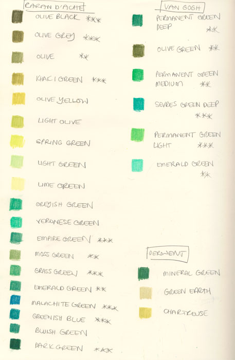
I once spent some time making a chart of every colour of green I owned across the different brands of coloured pencils I used.
ADVANCED COLOUR THEORY
Colour Science and Theory
Botanical artists need to know about colour science and theory i.e. HOW COLOUR WORKS
I'm best known as an artist for my use of colour - however when I retired I decided I didn't know enough about colour.
In July 2008 I undertook a very thorough study and review of colour - with a view to becoming better at understanding and using colour. The project became known as The Making A Mark Colour Project with the findings recorded in blog posts on my blog Making A Mark. I've included the main blog posts from that project on this page at various points. They make for a long read!
REFERENCE: Colour Science & Theory
DOWNLOAD Guides about Colour for free
- What is Colour? (2008) - Sets out the seven ways I decided to try and answers the question "What is Colour?" | Making a Mark
- Colour - a scientific perspective | Making A Mark - This post focuses on the science of colour – in simple terms: the defining characteristics of colour; how colour is made and how we see and think about colour
- Why your colours on screen don't look the same when printed | Making A Mark (10 March 2011) Have you ever wondered why your images on screen don't come out looking the same when printed? This post discusses: how the CMYK model works; why RGB files don't look like CMYK files and how to convert an RGB file to a CMYK file for printing purposes
DOWNLOAD Guides about Colour for free
| making_a_mark_guide_-_colour_a_scientific_perspective_v1.0.pdf | |
| File Size: | 356 kb |
| File Type: | |
Hues: Colour Space and Schemes
There are a number of different ways of describing how colours can be organised in space - and hence what sort of relationships they have. People have written at great length about colour relates one to the other. For example:
Personally I find I can tell when an artist understands about colour relationships by what colours they use in their painting and how these design the colour relationships within the painting.
Even when all the botanical artist is supposed to be doing is recording actual colour.
- relationships: Complementary, Analogous, Split complementaries Triads and Tetrad
Personally I find I can tell when an artist understands about colour relationships by what colours they use in their painting and how these design the colour relationships within the painting.
Even when all the botanical artist is supposed to be doing is recording actual colour.
Over time, many people have tried to develop ways of thinking about how colours relate to one another in space. I've been trying to learn more about this and also trying to find a way of making it all make sense to me.
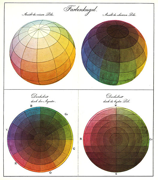
Goethe's Colour Wheel | wikimedia
Before James Gurney (Gurney Journey) wrote his very popular book Color and Light: A Guide for the Realist Painter (Volume 2)
he posted on his blog about colour on a regular basis
he posted on his blog about colour on a regular basis
- The Color Wheel, Part 1 - about the colours on the colour wheel
- The Color Wheel, Part 2 - about primary colours
- The Color Wheel, Part 3 - about complements
- The Color Wheel, Part 4 - about problems with the traditional artist’s color wheel, and its concept of primary, secondary and tertiary colors.
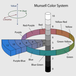
- The Color Wheel, Part 5 - covers the Munsell system
- The Color Wheel, Part 6 - looks at cyan, magenta, and yellow (the colours used by colour printers)
REFERENCE: Hues, Colour Spaces and Schemes
- Hues - a systems perspective | Making A Mark (2008) - Hues: primary, secondary and tertiary colours; How to represent colour ... Colour harmonics - complementary colours, analogous colours etc.
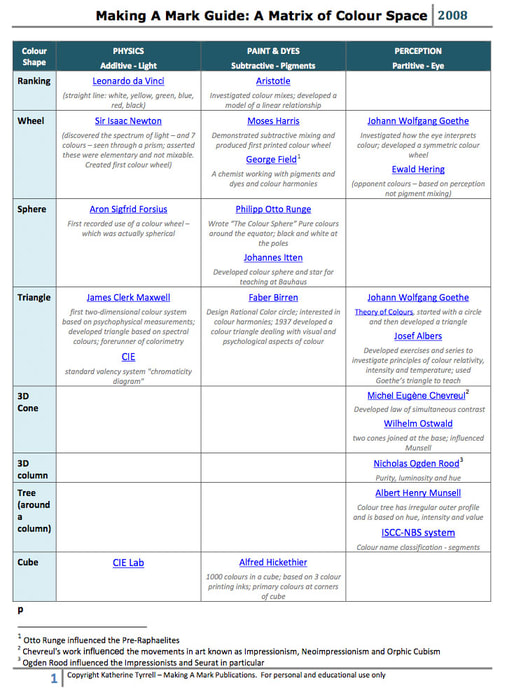
- Describing a colour space - there's more than one colour wheel! | Making A Mark (2008) - About a Matrix of Theories about Colour Space - which is the method I've adopted to categorise some of the people who have tried describe colour in terms of spatial relationships - to describe a colour space.
- A Matrix of Colour Space Theories (pdf file) (2008) About a Matrix of Theories about Colour Space - which is the method I've adopted to categorise some of the people who have tried describe colour in terms of spatial relationships - to describe a colour space. It provides a
- Complementary Colours and mixing neutral colours | Making A Mark (2008) - How to identify complementary colours in the context of different shapes which explain colour theory
- Analogous Colours | Making A Mark (2008) - This post is an attempt to redress the balance on the paucity of online information about analogous colours - but it also recommends other sources of even better advice and information!
- Colour Schemes: Split Complementaries, Triads and Tetrads (18 July 2008)
Discusses and explains three colour schemes used by professional artists: Split Complementary - a colour plus the two colours either side of its complementary colour; Triad - any three colours which are equidistant on the colour wheel and Tetrad - any four colours which are equidistant on the colour wheel
The following (below) explains my summary of different approaches to organising colour (above)
Describing a colour space - there's more than one colour wheel! | Making A Mark
- the columns concern different approaches to analysing colour. I've used the additive, subtractive, partitive approaches to differentiate processes relating to different fields.
- the rows are the different shapes which have been used over time for describing and modelling relationships between colour in space. The shapes - lines, circles, spheres, triangles, cones, cubes, columns, trees - are influenced by the principles which underpin each theory and are partly about how many colours are used for primary colours and whether or not the model is 2D or 3D.
- I've provided a very brief synopsis about each person's theory beneath their name.
- Footnotes indicate the periods of schools of painting which particular people influenced.
You can download the PDF file which contains this Matrix of Colour Space Theories above - this is a Table of Colour Theories organised by the different approaches to colour theory - additive, subtractive and partitive
| making_a_mark_guide_-_a_matrix_of_colour_space_theories.pdf | |
| File Size: | 144 kb |
| File Type: | |
|
INDEX
EDUCATION
|
Resources about Botanical Art and For Botanical Artists
ABOUT: About the Author | Contact | Testimonials | Privacy Policy COPYRIGHT 2015-22: Katherine Tyrrell all rights reserved.
|
NEWS
News Blog about artists, awards, exhibitions etc. |
EXHIBITIONS
- Calls for Entries - Exhibitions around the world - Online Exhibitions - RHS Exhibitions - Hunt Exhibitions ORGANISATIONS
- Botanical Art Societies - national / regional / local - Florilegium & Groups - Botanical Art Groups on Facebook |
EDUCATION
- Tips and Techniques - Best Botanical Art Instruction Books - Directory of Teachers - Directory of Courses - Online Botanical Art Courses - Diplomas and Certificates - Talks, Lectures and Tours ART MATERIALS (Paper / Vellum) BOTANY FOR ARTISTS - Scientific Botanical Illustration - Best Botany Books for Artists - Plant Names & Botanical Latin BOTANIC GARDENS & Herbaria |
FEEDBACK
Please send me . - news to share - info. about exhibitions - any suggestions for what you'd like to see on this website ADVERTISE Contact me if you'd like to promote workshops and courses on this site. AFFILIATION This website is free to you but not for me! (See Affiliate Income below) |
|
Cookies, Personal Data & Privacy tells you how this site relates to and impacts on you and your privacy - and your choices.
Product & company names may be trademarks of their respective owners |
About Affiliate Income: This website has been created to share information not to make a profit. I am an Amazon Associate and earn from qualifying purchases (e.g. books from Amazon) which helps offset costs associated with maintaining this very large website.
|
- Home
- NEWS
-
HISTORY
- What is Botanical Art?
- What is Botanical Illustration?
- Botanical Art History Books >
- Herbals
- Florilegia and Flora
- Patrons of Botanical Art >
- Past Masters - Botanical Art and Illustration >
- Famous Asian Botanical Artists (600-1900)
- 20th & 21st Century Botanical Artists >
- Botanical Photographers
- Botanical and Herbal Art Online
-
ARTISTS
- Botanical Artists in the UK
- Botanical Artists in North America
- Botanical Artists in Europe
- Botanical Artists in Australia and New Zealand
- Botanical Artists in Asia
- Botanical Artists in Africa
- Botanical Artists in Latin America
- Botanical Printmakers, Photographers, Sculptors et al
- The Jill Smythies Award
- Botanical Artists on Facebook
- Botanical Art Blogs
-
Exhibitions
- Calls for Entries - OPEN exhibitions
- Online Exhibitions >
- RHS Botanical Art & Photography Shows >
- The Shirley Sherwood Gallery of Botanical Art >
- Hunt International Exhibition of Botanical Art & Illustration
-
UK
>
- North America >
- Europe >
- Australasia >
- Asia >
- Africa
- ARCHIVE: World Wide Exhibition of Botanical Art 2018
-
Education
- NEW BOOKS about Botanical Art and Illustration >
-
Best Botanical Art Instruction Books
>
- Tips and Techniques >
- Botanical Art Video Tips >
- Online Botanical Art Instruction >
- International Directory: Botanical Art Teachers
- International Directory of Botanical Art Courses >
- Artist Residencies, Scholarships and Bursaries
- Diplomas and Certificates >
- Distance Learning Courses
- Talks, Lectures & Tours
- Botanical Education on Facebook
- Materials
- Groups
-
Botany
- Why botany matters to artists
- Botany Books for artists >
- Scientific botanical illustration
- Plant Forms and Anatomy
- Plant Evolution and Taxonomy
- Plant Names and Botanical Latin
- Botanical Dictionaries
- How to Identify Plants
- Recording a Plant / Sketchbooks >
- Botanic Gardens & Herbaria >
- Blogs about Plants and Flowers
- Contact
